SharePoint list using SkyBow - how to optomize for mobile devices

Has anyone optimized for mobile when SkyBow is used to customize forms on a SharePoint list? If so, please educate me.
-

Hi Lisa Heenan
Most parts in forms are responsive by default for mobile's browser (e.g. horizontal columns swap and render in new rows, tabs switches to an "accordion" control, etc.).
For sure you can optimize more things e.g. by configuring view formattings (e.g. Cards) to style list control on forms for even more mobile friendliness.
Or use our best practice styles for nice looking buttons (not only mobile specific): Form Styles Samples Collection0 -
Thanks for the response. This is for a list I've picked up from another builder. Needs both a mobile AND desktop use. The form looks great on desktop. On mobile, it's horrible. Could you be more specific about how to have both mobile and desktop forms on the same list?
0 -
Do you have screenshots of the form? Sounds like the earlier builder of the form added Styles to the form which makes it great looking on desktop but horrible on mobiles...
You can check the current form Styling configuration on your forms on "Styling" inside the forms designer0 -
Christof, I can get screenshots and share with you. We have users on desktop, iPhone, and iPad and the user experience differs slightly on each in the current build.
Side question: is there a way to run 2 different forms "1 for desktop - 1 for mobile" and if we can trigger them based on the type of device that opens the form?
0 -
There is no built-in functionality to open a different form for mobiles, but there are some workarounds.
A good workaround is using an Open form action as Form Load action (which loads another form on top when original form is opened):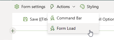
Add a Condition control to these Form Load Actions on your default form.
To check if the user is using a mobile device, there is some custom javascript code to check:const touch = ('ontouchstart' in window) || navigator.maxTouchPoints > 0;
const viewport = Math.min(window.innerWidth, window.innerHeight) < 900;
const spMobile = document.body.classList.contains("sp-mobile-view");
return touch && viewport || spMobile;Which can be used in the Condition action (4):
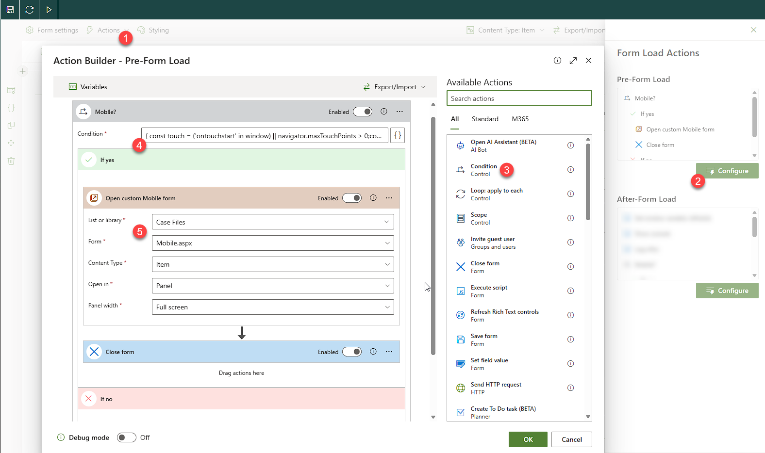 The Mobile.aspx form is a custom form manually created on the list with mobile optimized styles and reduced information/controls0
 -

Lisa, take screenshots of the same form (new/edit preferably), using the Desktop, iPad and iPhone...this will be a useful starting comparison. It wouldn't hurt to add a screenshot of the SharePoint list setting, so we can see how many and what types of columns are being used.
I've been using Skybow for 3 years now, and Desktop-Tablet-Phone designs have been some of my biggest development challenges. That said: I've figured out a ton of odd tricks, and depending on your form and everything involved, there might be numerous ways to accomplish certain things.
1
Please sign in to leave a comment.
Comments
6 comments